DATA GATHERING AND DISPLAY
describes a process of preparing and collecting data, for example, as part of a process improvement or similar project. The purpose of data collection is to obtain information to keep on record, to make decisions about important issues, to pass information on to others. Primarily, data are collected to provide information regarding a specific topic.
The intention of this workshop was to improve an understanding of data gathering, and how we could display it in a well understood format. In groups, everyone had to keep track of the energy consumption in their home for 24 hours.
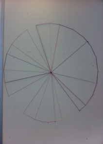
Once everyone gathered their findings, we were broken down into smaller groups and had to work out a way to display the data we had, using only pins and colored thread.
Using different colored thread we created a 24 hour clock with 24 pins, each an hour of time starting at midnight and round to midnight again. The chart allows us to see the different usage patterns and habits of each member of the group, for instance I use my laptop charger for 7 hours at 12am to 7am where as other group members were more efficient and left theirs on for a short period of time from 5pm to 9pm the same day. The final concept presented on the wall in the studio.
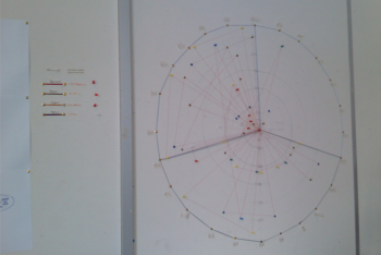
After we created a visualization of our data findings, we circulated into other groups and created an understanding of what their chart means and how they laid out their findings and we had to interpret and create a chart overlapping theirs.
Visualizing 138 Years of Popular Science Magazine
Jer Thorp, Data Artist in Residence at the New York Times and creative coder extraordinaire, explains the process behind his latest piece for Popular Science in a recent article. The task at hand was to visually represent the complete archive of their publication. The final piece is anchored by a kind of molecular chain – decade clusters in turn contain year clusters. Every atom in these year clusters is a single issue of the magazine, and is shaded with colours extracted from the issue covers via a colour clustering routine. The size of the issue-atoms is determined by the number of words in each issue.
"Picking out interesting words from all of the available choices (pretty much the entire dictionary) was a tricky part of the process. I built a custom tool in Processing that pre-visualized the frequency plots of each word so that I could go through many, many possibilities and identify the ones that would be interesting to include in the final graphic. This is a really common approach for me to take – building small tools during the process of a project that help me solve specific problems. For this visualization, I actually ended up writing 4 tools in Processing – only one of which contributed visually to the final result."
Reference Websites
Click on them to visit their websites.
BACK
Data Flow 2 increases the definition of contemporary information graphics. The book features new possibilities for diagrams, maps, and charts and investigates the visual and intuitive presentation of processes and data. Consisting of eight chapters that illuminate how techniques such as simplification, abstraction, metaphor, and dramatization function. Data Flow 2 is a valuable reference offering practical advice, background, case studies, and inspiration.
Inside the book...
I truly appreciated this book. It's filled with spectacular images of information and data visualization as well as art. It organizes the visualizations by categories, basic types of visualization - which is great, because it allows you to see how even widely opposing visualizations have common themes.